Project
Understanding Rules
Project focused on helping users understand rules with a clear error message.
Project
Project focused on helping users understand rules with a clear error message.
Project summary
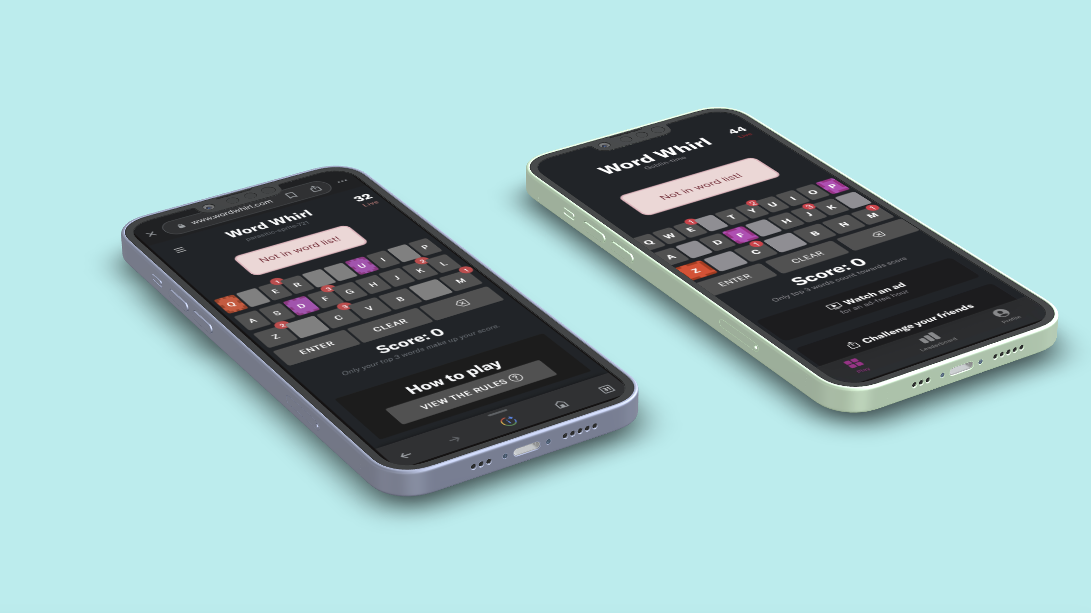
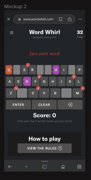
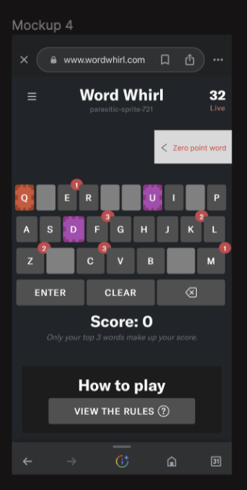
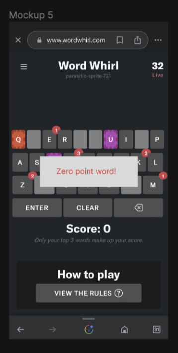
Mobile-firstA common complaint was that certain words were not in the word list. As stated in the rules tab this was because the word was either a proper noun, inappropriate word, or zero-point word. (Similar to the rules in scrabble). We needed one clear error message while playing that explained the reason in the moment. I focused on placement of the error message so we could test if we are communicating clearly.
Mission
If users did not understand, it was our fault, not theirs. Our goal is for them to understand that words are not valid without having to read the rules page.
Role
UX/UI, Design, Data
Team
CEO, Software Engineers
Focus
Placement of Error Message
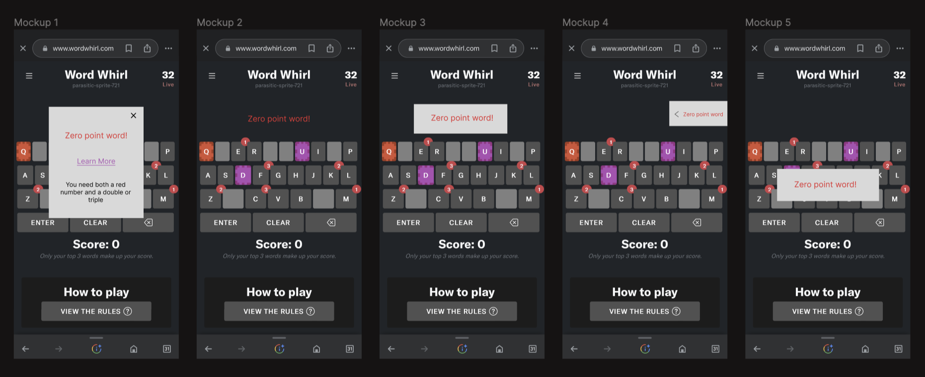
Mockups
I designed the feature in different ways to decide which placement was best for the users. I chose to focus on mobile since most new users are sent the link on their phones, and the first thing they will do isn't download an app. It is to use mobile.
One-on-one Research
For this project, we asked 20 randomized people in our target market (age 27-42) their opinions. I did one-on-ones because we needed to explain what they were looking at and how the game worked for them to understand the context of the feature. From the explanation we gave them, we collected quantitative data to help us choose which mockup to move forward with. We then asked them follow-up questions to understand why they felt a certain way about each question.
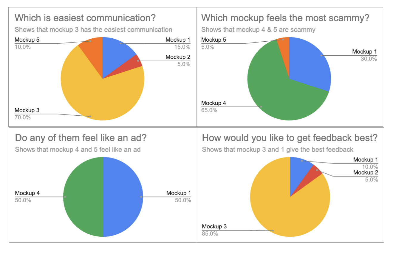
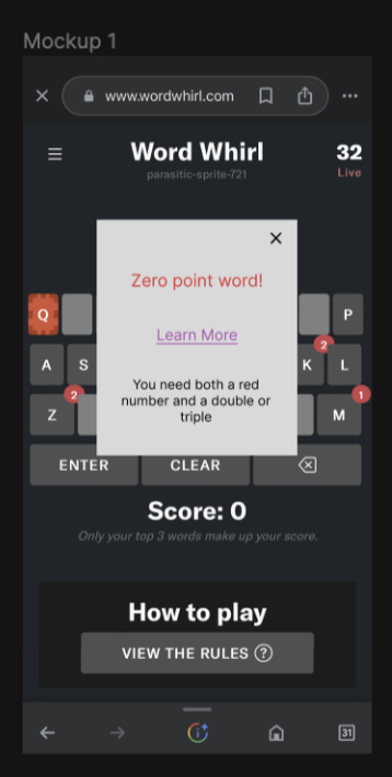
Mockup 1 feels scammy because it feels like a popup ad to get an email.
In mockup 2 the red throws me off because that's how the words show up.
Mockup 4 feels like a cookie. I want it off my screen!!!
I feel enraged mockup 5 is blocking my keyboard.
Mockup 3 is easiest to communicate because it is simple and to the point, no fluff.

Mockup 3 is the feature that makes the most sense because it doesn’t look like an ad, it doesn’t feel scammy, and it communicates to the user.
Choosing A Feature
Taking the research gathered from the mock-ups, I presented my decision and process to go with mockup number 5.
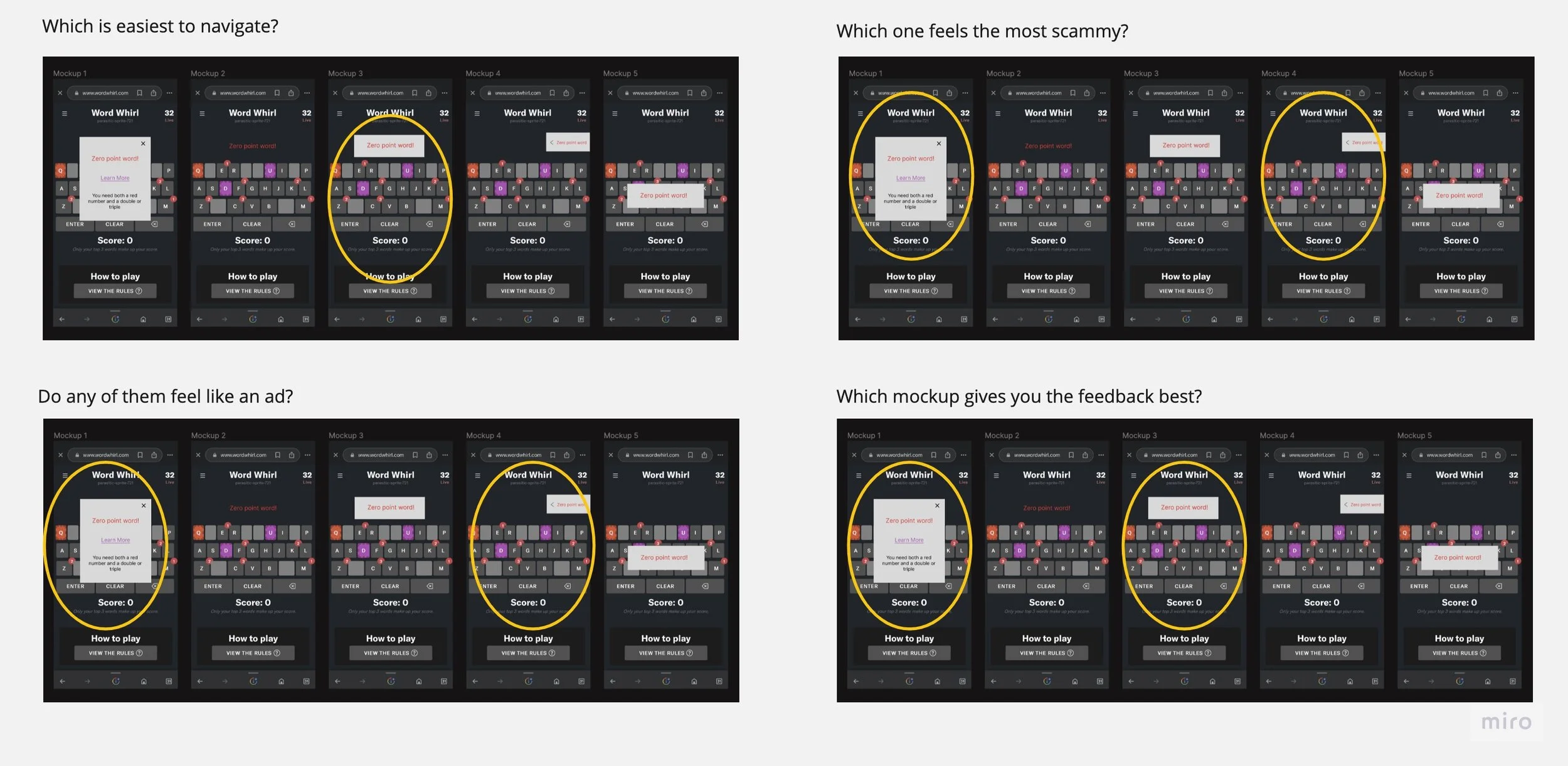
Above is a visual version of the data. By creating a visual like this, I make sure the data is easily translatable to the CEO or anyone who is quickly looking at the data.
Small Tweaks
After making a unified decision, I made some tweaks to improve the look and feel of the feature.
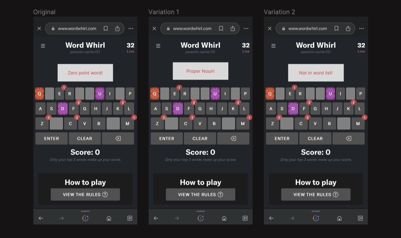
First, I ensured the format would look good with the different text variations.
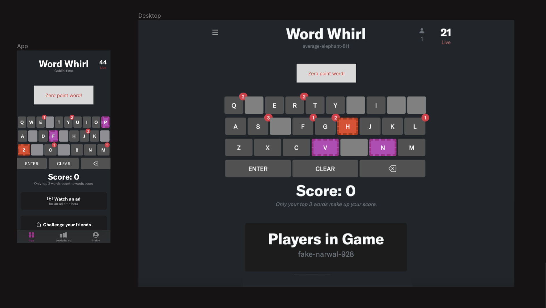
Then, I edited the text to be 16 pt instead of 18 and adjusted the box size since the format on the app and Desktop are different.
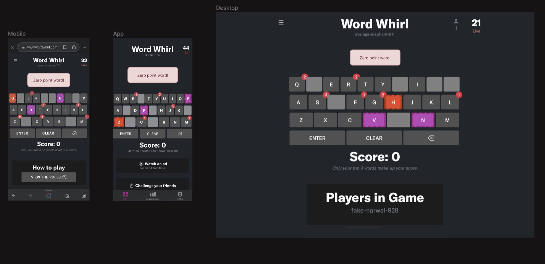
After ensuring the sizing would look good on all variations, I focused on blending the feature into the app. I rounded the edges, added the border, and made the colors fit better with the game’s aesthetic.
After making these changes, we have fewer complaints that “words are missing.” We have noticed a decrease in our users' frustration as they receive quick feedback on their words, and we are communicating more clearly with our users.
Outcome
Clearer error reasons, less frustration, calmer gameplay.